Jetpack Compose – TabRow
TabRow note. Custom Indicator .
Result
| Default Indicator | Custom Indicator |
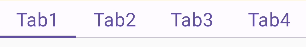 | 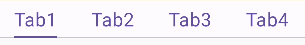 |
文件
TabRow.kt – doc
Kotlin
@Composable
fun TabRow(
    selectedTabIndex: Int,
    modifier: Modifier = Modifier,
    containerColor: Color = TabRowDefaults.containerColor,
    contentColor: Color = TabRowDefaults.contentColor,
    indicator: @Composable (tabPositions: List<TabPosition>) -> Unit = @Composable { tabPositions ->
        TabRowDefaults.Indicator(
            Modifier.tabIndicatorOffset(tabPositions[selectedTabIndex])
        )
    },
    divider: @Composable () -> Unit = @Composable {
        Divider()
    },
    tabs: @Composable () -> Unit
) {
說明
- selectedTabIndex:選中的Tab
- containerColor: TabRow的背景Background
- contentColor:Tab本身 Compose
- indicator:Tab下面的底線
- divider:TabRow的底線
- tabs:Tab們
Tabs
需要建立 tabs 並且在 TabRow 裡面的 tabs 跑迴圈去建立 Tab
Tab裡面的 content -> Compose 可以建立任何你想要的UI
pagerState呢?是為了給 HorizontalPager 而建立的
Kotlin
@ExperimentalFoundationApi
@Composable
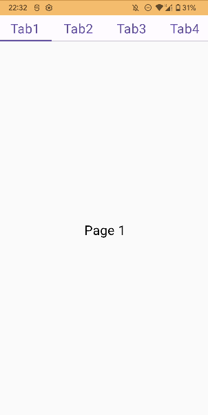
fun TabHostWordpress() {
val tabs = listOf("Tab1","Tab2","Tab3","Tab4")
val pagerState = rememberPagerState(initialPage = 0)
...
Column(
modifier = Modifier.fillMaxSize()
) {
TabRow(
selectedTabIndex = pagerState.currentPage,
tabs = {
tabs.forEachIndexed { index, tabName ->
Tab(
modifier = Modifier.padding(8.dp),
selected = pagerState.currentPage == index,
onClick = {
scope.launch {
pagerState.scrollToPage(index)
}
},
) {
Text(
text = tabName,
fontSize = 24.sp,
onTextLayout = {
tabWidths[index] = with(
density
){
it.size.width.toDp()
}
}
)
}
}
}
)
HorizontalPager(pageCount = tabs.size , state = pagerState) {
Box(
modifier = Modifier.fillMaxSize(),
contentAlignment = Alignment.Center
){
Text(text = "Page ${it + 1}", fontSize = 24.sp)
}
}
}
}Custom Indicator Result
為了達成這個效果,必須在TabRow的indicator屬性裡面去設置,我們必須要重寫他的方法
這是他原本寫的方法,我們必須加入每一個Tab的寬度,讓他的底線可以依照我們的文字寬度。
Kotlin
    /**
     * [Modifier] that takes up all the available width inside the [TabRow], and then animates
     * the offset of the indicator it is applied to, depending on the [currentTabPosition].
     *
     * @param currentTabPosition [TabPosition] of the currently selected tab. This is used to
     * calculate the offset of the indicator this modifier is applied to, as well as its width.
     */
    fun Modifier.tabIndicatorOffset(
        currentTabPosition: TabPosition
    ): Modifier = composed(
        inspectorInfo = debugInspectorInfo {
            name = "tabIndicatorOffset"
            value = currentTabPosition
        }
    ) {
        val currentTabWidth by animateDpAsState(
            targetValue = currentTabPosition.width,
            animationSpec = tween(durationMillis = 250, easing = FastOutSlowInEasing)
        )
        val indicatorOffset by animateDpAsState(
            targetValue = currentTabPosition.left,
            animationSpec = tween(durationMillis = 250, easing = FastOutSlowInEasing)
        )
        fillMaxWidth()
            .wrapContentSize(Alignment.BottomStart)
            .offset(x = indicatorOffset)
            .width(currentTabWidth)
    }
建立一個方法
Kotlin
fun Modifier.customTabIndicatorOffset(
    currentTabPosition : TabPosition,
    tabWidth : Dp
) : Modifier = composed (
    inspectorInfo = debugInspectorInfo {
        name = "debugInspectorInfo"
        value = currentTabPosition
    }
){
    val currentTabWidth by animateDpAsState(
        targetValue = tabWidth,
        animationSpec = tween(
            durationMillis = 250,
            easing = FastOutSlowInEasing
        ), label = "currentTabWidth"
    )
    val indicatorOffset by animateDpAsState(
        targetValue = ((currentTabPosition.left + currentTabPosition.right - tabWidth)/2),
        animationSpec = tween(
            durationMillis = 250,
            easing = FastOutSlowInEasing
        ), label = "indicatorOffset"
    )
    fillMaxWidth()
        .wrapContentSize(Alignment.BottomStart)
        .offset(x = indicatorOffset)
        .width(currentTabWidth)
}
Kotlin
val tabWidths = remember {
val tabWidthStateList = mutableStateListOf<Dp>()
repeat(tabs.size){
tabWidthStateList.add(0.dp)
}
tabWidthStateList
}
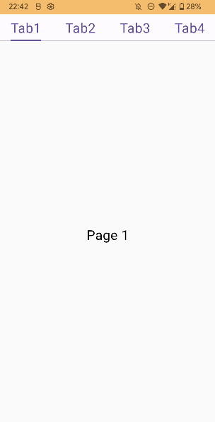
Column(
modifier = Modifier.fillMaxSize()
) {
TabRow(
selectedTabIndex = pagerState.currentPage,
indicator = {
TabRowDefaults.Indicator(
modifier = Modifier.customTabIndicatorOffset(
currentTabPosition = it[pagerState.currentPage],
tabWidth = tabWidths[pagerState.currentPage]
),
height = 2.dp
)
},